Friday 15 April 2016

MEST2 Evalution


MEST 2 Evaluation

The brief for this coursework entails that we produce a 3 minute video based on one of the seven genres we’ve been given as an option in addition to a promotional print booklet to accompany it as part of a competition. For the broadcast aspect of it (film itself) which we titled ‘La Sombra,’ I worked with Callum Louis, Ra’eesah Khan and Mamduh Adan, working on the modern noir genre.
  
The research I conducted contributed to both planning and the final product in the sense that it informed aspects of the modern/neo-noir genre that we had chosen to develop into. With it essentially being an ‘updated film noir’, films like Sin City and Agent 47 specifically contributed to the way we approached this production. Elements such as the usage of the colour red help show this. Akin to Agent 47 we decided to this with the red suit solely as well as red lighting in the party scene. The colour red has connotations of violence, blood and power so the use of it here works quite effectively with the direction of the film.

Institutionally, the research I carried out followed agencies such as Film London as well as the BBFC. With Film London, as part of the Microwave Film scheme, looking at some of the films from it such as Ill Manors and Shifty helped me understand what exactly ‘makes an arthouse film arthouse.’ In particular what stood out here was the aspect of informing the general public on issues rather than solely aiming to entertain them. At the same time the BBFC research had an impact with the fact that we had to ensure that we were abiding to the age rating guidelines for a 15-rated film e.g. strong violence, frequent strong language etc. This can be seen in the production itself with us keeping anything like blood, or any proper graphic violence out of the mix.

In terms of audience, carrying out a focus group helped us be not only being aware that the film concept was good, but also that there many aspects we could touch up upon within such as having an antihero and drug dealing by European gangs.

The target audience for this film ranges from teenagers the age of 15 to 45-year olds, with them being predominantly male. With this in terms of psychographics the explorers, reformers and succeeder groups can be thought to make up this target audience. Explorers in the sense that the film takes place in a range of locations whether it be a party or a train, reformers in that it offers a different take to the modern noir/crime genre with a foreign silent killer and succeeders since the film is arthouse, which is a genre something often associated with prestige and ‘culture capital’/familiarity with high cultural forms.

This said, the brands that appeal to the audience would range from things like Apple products, of course more towards succeeders, British Airways/Virgin Atlantic for the explorers and Oxfam/Fairtrade for reformers. With other films though, one particular one that would be watched by the audience is ‘City of God.’ Not only being in the crime genre of film, City of God is also foreign language which is something we implemented into our production. Films this would be likely to be watched by the intended audience on platforms such as streaming and VoD services like Netflix and Google Play Movies as opposed to DVD and Blu-Ray, and this is the case since the audience in this case mainly covers young people.

Overall, the target audience for this production does appear to be quite strong in that it is broad enough to not solely appeal to just a niche crowd. As well as this is the fact that in terms of age, the audience is good in that it means other more modern platforms of movie-watching can be exploited which young people put into use such as video on demand. It can though to some extent, be thought to be weak as it predominantly caters towards males rather than females which also makes up quite a large proportion of movie audiences. This is particularly more apparent nowadays as suggested by theories such as Rosalind Gill’s ‘female gaze’ with post-feminist media culture in Britain meaning that men are also being presented in film for women to look at.

The early section of the film works to allow viewers to become immersed in the actions of the main character, La Sombra. At 00:00-00:07 and 01:03-01:09, camera movement is used in the form of tilts to help give the audience a proper idea as to what La Sombra is doing as he receives this phone call from his boss. The first time this tilt is implemented is when he drinks from his hip flask and this effective in showing how crude he is in his ways and not the formal type his suit might suggest him to be. The second time it’s used is for a tracking shot of the phone landing in the canal, simply helping to show the destruction of any evidence that may connect La Sombra to a job. It can be said that mise-en-scene also plays an important role here since the setting does appear as being quite secluded with no one in sight other than the main character. Alongside this though, the throwing away of the phone also acts as an action code (Roland Barthes) since it does suggest that the protagonist will be going ahead to fulfil this hit, working to further the narrative.

Another section of the film shows us the eventual lead-up to La Sombra murdering his target in a mask party. Beginning from 03:17, and ending at 04:04, we first see him [La Sombra] picking up and wearing a mask. Everyone else in this party is wearing one of these props, so this works out from a mise-en-scene standpoint in making sure that he’s not out of place in the whole thing. After this he looks at the ID he has of his intended target and uses this to help him identify him within the crowd and with this a panning shot is used as he does this to make it evident that he is actually searching for him. Heading forward, the brandishing of the syringe is an action code in suggesting that the person he shows this to is going to be killed, and this is exactly what takes place. Just as he kills his target, the lights in the room go from red to white, a particularly dramatic effect to the whole scene. Along with this the non-diegetic music cuts out just as this happens, helping to show the pure magnitude of the event.

When the front cover is concerned, most of the conventions have been stuck to albeit with different takes on them. For example with the ‘The Little Picturehouse’ title rather than being in the top third of the cover, it’s placed vertically along the far-left side while still being identifiable by readers. Other than this though, it still contains a central image of the main actor of the production as well as the date of its release, cover lines and a puff just to name a few things. What stands out particularly here though is the usage of a uniform colour scheme throughout the cover with the pane on the left, cover lines and puff, all matching the colour of the suit of the actor in the cover. This colour scheme carries on throughout the rest of the magazine with both the contents page and the double-page spread.

Conventions can also be found in the contents page with it including the word ‘contents’ in bold right at the top of it. Along with this the page numbers are in bold which helps readers see clearly the page of each feature. On the right side of it is another picture of the main character, this time with no face though and him doing up his tie, adding to this idea of mystery within it. An addition that may appear as being unusual is the syringe on the left side of the (first) page. What it is though, is the weapon used to kill the target of La Sombra in the actual film, so a sense of synergy is established there.

With the double-page, along with the continuing colour scheme there’s also a headline for the feature, stand first introduction, drop cap and another image of the main character. With this though while the typical column layout is present on the second page of the spread, on the first one the text is wrapped around it which just helps to showcase another level of professionalism. One more thing to add is that the social media icons in the bottom-right corner are not only representative of common features of magazines nowadays, but at the same time assist in targeting the main audience of the production [young people] more directly since they are networks predominantly used by teenagers.

I’d say my printwork is strong in the sense that there’s a solid level of consistency throughout it whether that be with the font of it all or the colour scheme. Not only this but it’s apparent there’s a level of complexity, especially with things like the wrapped text in the double-page, the page numbers in bullet holes in the contents page (keeping with the theme present in the film) and use of vertical text as opposed to horizontal in some cases. Also overall it helps recognise the target audience with the use of the social network icons in the corners of each page which is something quite significant. At the same time though, it could’ve been better by doing things like actually having something in the background rather just it being plain black, refining some of the edges around the character’s hair and additionally, perhaps having more pertaining to the actual competition itself just to make it clear what the print is in dedication of.

Throughout the production work, representations are generally reinforced. One of the most apparent ways this is the case is with the portrayal of the main character. With him being the main protagonist, and receiving the most screen time, Rosalind Gill’s theory of the female gaze specifically can be applied in that males are in some sense objectified by female viewers. In addition to this with the taxi driver appearing to be of South Asian descent, Tessa Perkins’ theory can be applicable since it is to some extent true that taxi drivers tend to be Indian or Pakistani. 

If I was also to create an online blog as part of a third brief relating to e-Media, things like social media especially play a particularly significant role in its overall content. So rather than just having things like icons of popular social networks in parts of the print work, I would have had to mention things such as a social media campaign maybe with the use of a hashtag, i.e #LASOMBRA, and this would relate to user-generated content. UGC works particularly well as it seems a lot more ‘genuine’ coming from actual viewers or people interested in a product, in this case the film, rather than distributors. Examples of this lie in things like the Tag London campaign for Ill Manors where people were requested to make/posts tweets with the hashtag #ILLMANORS. What this actually helped do was promote his product in a way that was both cheap for him and more likely to generate attention for it, with user generated content (UGC) being something more easy for people to associate themselves with rather than things from an institution.

In addition to this from an industry/institution standpoint, what I’ve could’ve done is start establishing links between the film and Spanish cinema (institutions) really furthering the fact that it is, at least in part, a foreign language film.  Not only this but with it being known that the British film industry is more production rather distribution-led, the inclusion of say an American arthouse-based institution perhaps co-producing the film could have assisted in not only cross-promoting an institution but also working to solve a current problem within the British film industry.

In conclusion, I believe I have met the original brief set out for us. With me not only creating a film that works sufficiently within the modern noir genre that we selected, but also creating printwork that links in with it well while still pertaining to the general conventions of print, I without a doubt worked well within the brief. In terms of the media marketplace, I think that the product would be successful simply due to the fact that it’s a ‘tried and tested’ genre albeit with a number of differences and this would get curiosity for the film, something particularly associable with the arthouse audience, running quite well.


Tuesday 23 February 2016

Friday 12 February 2016

BFI trip notes


BFI trip notes

  • The concept of exchange, in that the consumer gives something (this tending to be money) and also gets something in return for it and how it can differ from institution to institution. For example, a consumer paying for a ticket to watch a film produced by Marvel Studios is bound to expect 'spectacle' throughout the film as well as a generally engrossing storyline. This of course changes when you go on to look at another institution like Vertigo Films, and this concept can be considered from an institution/production company standpoint as well as a film one too.
  • Depending on the audience, particularly from a location point of view, the pleasures/gratifications derived from watching a British film can vary. For example, a British audience get a sense of personal identification on the grounds that they get an element of national pride and solidarity, while an international audience get it in that they're getting a sense of solidarity with other subcultures that exist in Britain and learn about things they likely wouldn't have without watching the film.
  • Films generally exist within one of the following three types: arthouse, multiplex and crossover/prestige. While arthouse relies on quite a low budget and being particularly prominent in foreign and/or specialist cinema, multiplex films are usually the 'typical' film (like blockbusters) being quite popular amongst members of the public when attendance is concerned e.g. VUE. Crossover/prestige however, are films tend to have quite big name actors at low budgets while also amalgamating elements of different genres together.  
  • When different film genres are concerned, heritage films usually involve looking back at notable times in British history, some unknown about before by the general public, and turning them into productions. These usually follow the Royal Family and what they do quite clearly, is provide a sense of personal identification with British viewers and provides them with national pride with their country. Looking at it from an international standpoint, the films can inform audiences on aspects of British history that they may have been unaware about before and in turn can also help in increasing tourism in the country, particularly with the shots they tend to contain of British landmarks.
  • The social realism genre, which we have seen presented with films like Ill Manors though, can often be viewed as the exact opposite of these heritage films. This is particularly evident through them often being quite critical of elements of British life and not reinforcing the patriotic values present in heritage. With this they challenge the audience's comfort zone and while they do tell the audience about different sub-cultures in Britain, what's more interesting is what they do to a British audience in that they inform on the way other people in it may live and reject values they may have assumed were commonplace before.

Tuesday 26 January 2016

Photoshop tutorials


Photoshop tutorials

How to change background

How to blend images with one another

How to use selective colour

Friday 22 January 2016

12D: MEST2 Progress report


Progress report

  • Work completed since 6 January
Since the 6th of January, we have completed all of our pre-production work including but not limited to the script and mise-en-scene document, we've got most of our props that'll be used in the film and we have confirmed with all the people we want in the film, when they need to be available for.
  • Any incomplete pre-production tasks
The storyboard and shot list for the production may need to be re-looked at in consideration of scenes/parts of scenes we may have added or modified over the past few days. Not only this, but the mise-en-scene document will have to display the fact that there has been a change in the actors playing lead characters for instance the most important one, being La Sombra's actor being replaced as a way of reflecting what his ethnicity is more likely to be - fair-skinned and of a reasonable height.

  • Next steps/action plan
Filming for the production should begin on 23/01/16 with the audio recordings having been done. For this to happen though we need to ensure that everyone we plan to have in the party scene of the 3-minute clip, will be available on the day that filming happens on and in addition to this we need to have all the props that we planned to utilise ready e.g. briefcase, syringe etc. 
  • Date filming will be complete
Seeing that things go to plan filming for the production should be complete on the first, if not second week of February.
  • Requirements for photo shoot next week
For the photo shoot next week, the main things that we require are appropriate clothing for the main character to truly deliver the aura that we want to with readers, all the props such as the syringe that will be used in the production to murder the supposed target and also that same actor that actually will be playing that mistaken target.

Wednesday 13 January 2016

MEST2 Print brief


MEST2 Print brief


Research


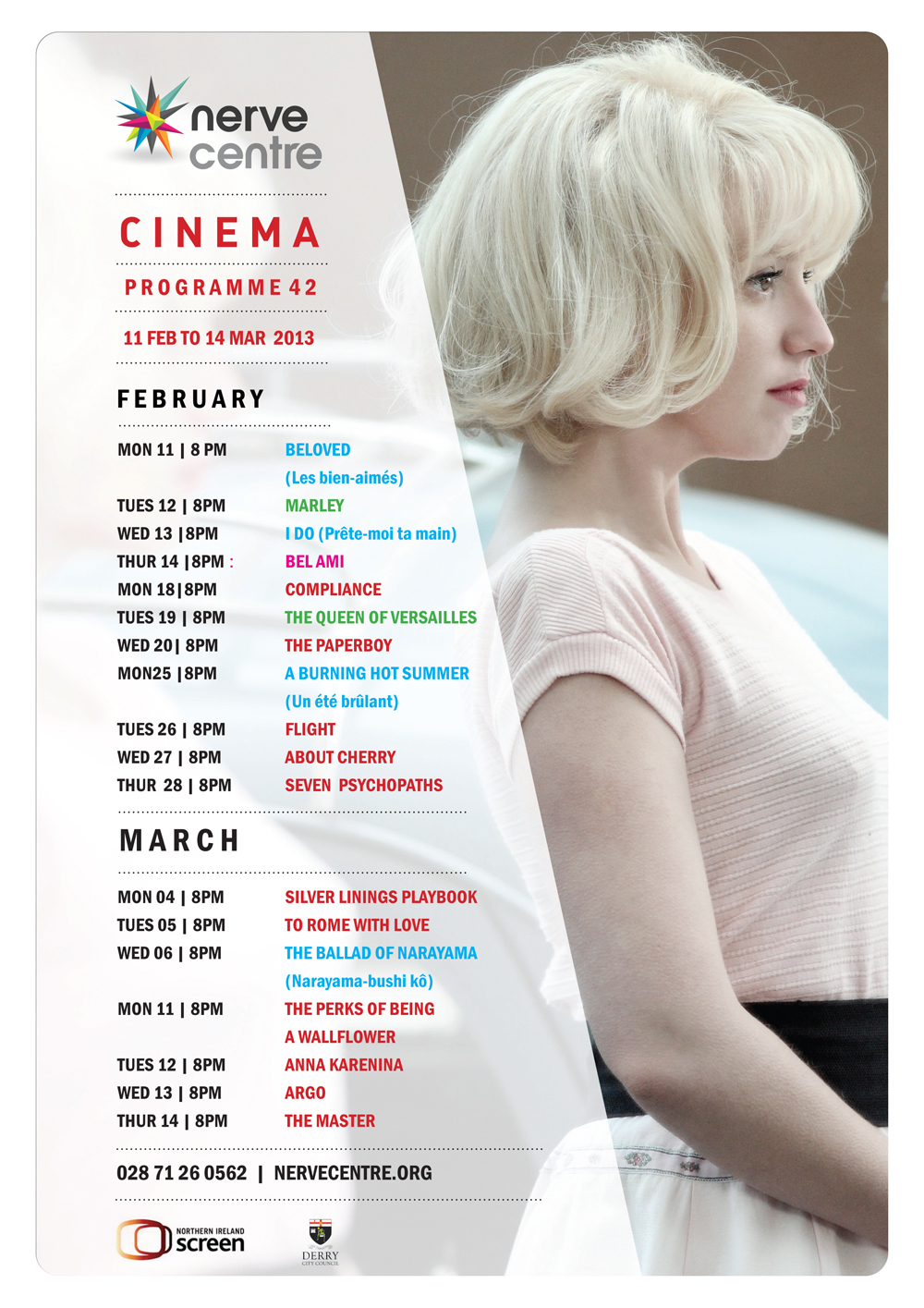
  1. In terms of key conventions of magazine front covers that the BFI Film Festival programme front cover incorporates, not a lot can be referred to starting with the title of the publication itself. Being placed in the centre of the cover, the title essentially acts additionally as a central image too helping 'establish the magazine's core [...] identity.' The date follows right below this title, this time with the purpose of informing readers of the actual date of the festival, explaining why it's in a bigger font in comparison to 'In partnership with' to ensure that readers understand when exactly they can expect to attend it - the most important thing. Lastly, from a colour scheme standpoint the cover can be regarded as being quite minimalist with its primary use of colours solely within the title and only a black background being used. The colours that are actually used, located in the title, have connotations of more of a party environment with the multi-coloured lights (e.g. red, purple, orange etc.) which help convey the whole vibe of going to a festival.
The magazine mainly strays away from the more traditional variants through its use of a title acting also as a central image. With titles usually being placed within the top third of a cover, the fact that it has been placed within more of a central position in this cover shows the contrast between it and other magazines. This goes on to make it more visually appealing since by using a stencil font and having an image 'making up the colour of it' instead of a simple and more conventional solid font colour, the film takes a different and arguably more professional design approach.

2. 


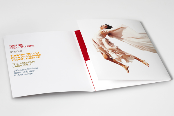
The collage layout of this brochure is something that could definitely be possibly implemented into the print brief instead of the typical one picture cover to widen focus to multiple different images that have relevance to the production.

Smiley face
Perhaps not necessarily having a whole image occupying the front cover is something that can be picked up on here and with that maybe with how the cover is laid out in the image above, the title could also be manipulated in terms of positioning which will be talked about in one of the next few images.

Having a picture-in-picture might be something that we could use to help us portray two important things at the same time instead of putting them all within the double-page spread - alternative to the college layout.

Here, in taking note of the vertical position of 'SPRING 16,' it has to be considered how the title of the magazine will be presented such as whether it'll be in the more usual horizontal positioning or instead, diagonally for example.


Lastly, a front cover doesn't necessarily have to have one actor in it and actually there can be multiple different people in it as shown above. This could be implemented with the magazine for 'La Sombra' in that both La Sombra and the mistaken target could feature on the cover.


3.


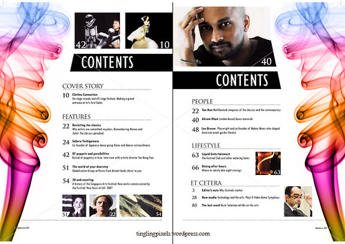
A more simple layout for the contents page with the page magazine sections on the left side of the page and a picture on the right, can actually go on to give off a more sophisticated appearance to content. That, coupled with a simple black or white background also helps contribute to this same appearance.


The images that we actually end up incorporating in the contents page don't have to occupy whole pages and instead we can use different ones with different sizes in mind which can also assist to make it easier in using multiple images.


Perhaps having other images flanking both of the contents pages, could make the magazine appear more professional, but only if done properly. For example, having a syringe on each side of the pages in the same way it's done in the image above would be appropriate since it suggests that it has some sort of significance relating to the main feature of the magazine.


What can be learnt from these contents pages is that the way the pages as well as their respective numbers are actually presented can actually be toyed around with instead of just kept in the usual format. For example here, different characters from different productions are put into bubbles with the page number detailing the film they're in next tot them.

Although we're of course, required to use pictures in our contents pages what this shows is that colour can also be used almost as if they're codes in relation to different sections there are in the magazine. An example of this could be the 'La Sombra' heading being represented with a red colour block next to it and 'Transgression' having a green one instead.

Planning and sketching

Target audience appeals:

  • Competitions or free/promotional offers in order to help them save money with the fact that the age range does start from teens
  • A  sense of danger due to the more rebellious nature of the teenage age group
  • A use of both text and pictures, and not just excessively large blocks of text within the article
  • A presence of colours in the article and not being too monochromatic
  • A twist on something that has been ongoing for a long time - a silent hitman in a film to do the Mexican cartel

Double-page spread:


  • 'Silent killer'
  • 'Dead on target'
  • 'Under the shadow'
  • 'Fear the shadow'
  • 'Hit list'
  • 'One-hit wonder'
  • 'Sombra'
  • 'Assassin'
  • 'Tough love'
Contents page


The syringes on the side of each of the two pages, help to relate to the weapon La Sombra uses to take out his adversaries - as seen in the 3 minute clip.


Front cover


Photoshoot
  1. The character that'll be appearing on the front cover of the print will be the central protagonist of the production itself - La Sombra. This will give the opportunity for the character to be showcased effectively in addition to the film/production he actually stars in itself.
  2. The image that'll be required for the contents page is a still shot of La Sombra seemingly 'leaning on the left side of the page.' While this is done a shadow can also be present in the image just a subtle way of referring to the actual English translation of his name - the shadow. To do this, the rule of thirds will have to be utilised to make sure that the actor playing La Sombra is on the left section of the image.
  3. For the double-page spread, one of the images that'll be used is La Sombra on the phone to the cartel boss while overlooking Grand Union Canal (back facing the camera). This provides the image with a more enigmatic tone with the face of the protagonist not being visible to readers. This combined with the murky tinge of the water, low angle shot and vignette effect (across two pages) will also help deliver the exact dark atmosphere that we intend to convey to readers of the magazine.
  4. Shot list:
  • Long shot - La Sombra with his side to the camera (full body shot)
  • Medium shot - La Sombra holding the mask he uses in the party scene
  • Close-up - La Sombra wearing the mask (only having half of his face visible)
  • Long shot - protagonist drinking from a hip flask (full body shot)
  • Medium shot - shadow with a briefcase next to it
  • Close-up - showing La Sombra with his fingers on his tie as he undoes it, perhaps with a splatter of blood on his shirt
  • Medium shot - La Sombra holding a briefcase with both hands
  • Medium shot - La Sombra sitting down with a hip flask in his hand and briefcase placed in front of him
  • Close-up - syringe in protagonist's hands
  • Medium shot - protagonist proceeding to kill his supposed target with the syringe his hand, as if it is captured just a moment before he gets killed

     5. Costume, props and make-up:
  • Syringe
  • Alcohol bottle
  • Hip flask
  • Suit
  • Tie
  • White shirt
  • Briefcase
  • Mask

     6. One of the things I'll be doing to ensure everything is prepared for the actual photoshoot is            talk to both the person being cast as La Sombra and also the unintended victim to make it            clear when they need to be coming to the classroom for the photoshoot. Not only this but I'll          have to make sure we have all the props necessary such as the hip flask and mask to                  deliver on the planned shots as I envisaged them to have been taken.

Double-page spread


THE STORY

Enter the mind of an assassin: La Sombra. Essentially being the embodiment of the strong, silent type he goes about his duties with not finesse, but simple brute force and a swig of whiskey by his side. However when he ends up taking out the wrong man, he realises that the same associates that were once by his side now become new additions to the set of demons that he already has and must be wary of. And while his first instinct is to run back to the shadows that inhabit the night, when he realises that his lover is kin to his boss, he takes it upon himself to resort back to the shady dealings he knows so well.

ENTER THE SHADOW

I’LL PAY FOR THE MISTAKES I’VE MADE, BUT NOT WITH MY LIFE. These are the words La Sombra’s philosophy lies so deeply within. What he does to keep his life however, isn’t the matter whatsoever whether it means the killing of a single target or mass murder. Learning to the use alcohol as a therapeutic essence, the ‘sicario’ is desensitised to any form of bloodshed he may have to witness or be a cause to throughout a day’s work, whether it be that or memories from his broken childhood. Emanating from the home of lions and bears in Galicia, it was beyond a shadow of a doubt that La Sombra would end up where he did and find so much comfort within the backstreets in which he figuratively lives in.

TRADE

At the heart of this whole plot though, is the Spanish human trafficking ring that La Sombra works for. Selling women to warlords and other men alike, the group is thought to be one of if not Spain’s most dangerous crime syndicate about. And while the ring’s primary focus is on business and in the grand scheme of things making money, stepping in the way of their business is you becoming their business to deal with. Ruthless and unforgiving is a light way of putting the way in which the cartel deal with things and people who do end up stepping in their way usually get forgotten about within a short space of time.

SILENT KILLER


It’s often said that ‘silence is sometimes the best answer,’ but in the case of La Sombra silence is the only answer.  Impacted by traumatic moments in his childhood with an abusive father and ill mother, who both died in adolescence, the hitman has been mute since single digits and has since found refuge within the number of gangs that coexist within the underbelly of the cities. Once he reached adulthood though, his way of talking changed from simply throwing his fists about aimlessly with no target in mind, to weaponry whether it be knives or the natural complement to bullet ammunition. However, when it comes to  one of the more imperative and life-changing decisions,  the contract killer has to take it upon himself to pay for his mistakes through his words.

Tuesday 5 January 2016

Pre-production


Pre-production

Project schedule


Mise-en-scene

Casting details
  • Khalid Abdillahi – will be doing La Sombra’s voiceovers as he’s had sufficient experience in actually speaking Spanish. Not only this, but he'll also be the unintended victim that ends up getting killed by our main protagonist at the mask party
  • Callum Louis – will be acting as La Sombra since he fits the role of the character from a racial/ethnic standpoint
  • Mr Halsey – could potentially be cast to perform as the cartel boss to make the film appear more authentic
  • Deepak Marok - will be cast as the bouncer for the mask party by the lecture theatre doors
  • Callum's dad - will be cast as the taxi driver for the cab scene
  • Range of people from Year 12 - a range of people from the year will be cast as the partygoers at the masquerade

Location scouting with photographs


  • Grand Union Canal – While we had originally planned for our setting to make use of Brighton Pier as a primary location for the film, we considered things like timing issues and weather and realised that going to the nearby canal would be a much more viable option. Not only is it more local, but it’s also a location that has many aspects to it that could help in making our film come across to viewers in the exact way we want it to e.g. the more murky tinge to the water could help contribute to the darker undertones the production is supposed to have.

  • Drama studio – this location will be used for the party scene to take place in where La Sombra plans to take out his target discussed with him by the cartel boss (Don Javier). It would make for an effective setting for this to take place in as with the studio being quite large, if presented well enough with different props, it could pass off for being the location of a party.

  • (Outside) lecture theatre – this location will be used for the scene that involves La Sombra’s interactions with the bouncer at the door of the party since the completely opaque double doors of the lecture theatre, look like something you might see at the entrance of a (private) party.
Props
  • (Fake) phone – will be used by La Sombra to communicate to the cartel boss
  • Briefcase – contains the details about the target La Sombra is pursuing
  • Hip flask - contains the alcohol La Sombra constantly consumes
  • Masks – the party is a ‘masquerade,’ so each of the attendees will be shown wearing masks
  • Syringe – will be used by La Sombra to take out the target
  • Target details – sheet of paper that’ll be found in the briefcase detailing the characters of the target

Costume and make-up
  • La Sombra – will be wearing somewhat of an ‘ill-fitting’ suit with undone buttons on his shirt just as a way of suggesting his more unkempt and rough nature being drunk a lot of the time 
  • Partygoers – casual shirt and trousers 
  • Incorrect target – may have to use make-up as a way of showing his pain while succumbing to the lethal effects of the injection


Lighting 
  • Natural light – will be used during the canal scene just due to the fact that it takes places in an outdoor setting 
  • Low-key lighting – will be used in the party scene as way of making the location look all-the-more glamorous as well as mysterious